
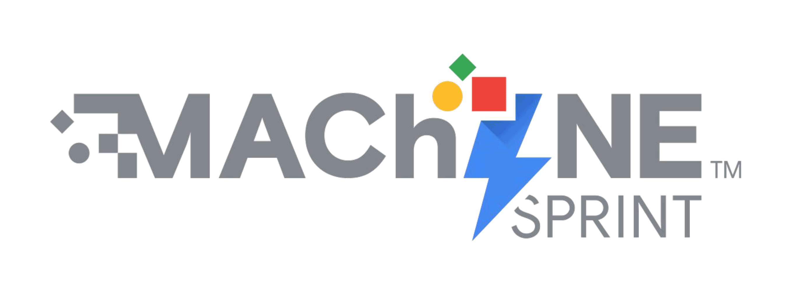
New branding and design system for MAChINE SprintTM

Based on Jake Knapp's Design Sprints the Google ZOO developed its own sprint methodology. They help clients gather insights and move from idea to prototype using Google technologies and products in a matter of days. They call it 'MAChINE SprintTM'.
CONTEXT
– How might we communicate the individual character of MAChINE SprintTM and keep it aligned with Google's own design system and product portfolio?
– How might we create a vibrant and intuitive design toolkit that can be used by team member?
CHALLENGE
After analysing the previous design iteration I created a narrative that translates the MS's 3 building blocks into visual form, and developed a design system that enables the team to produce a consistent Sprint toolkit and offer the client a seamless brand experience.
OUTCOME


PROJECT overview
This assignment consisted of a comprehensive brand audit and re-design of Google ZOO's MACHiNE Sprint TM visual identity and design system, with the primary purpose of imbuing the brand with a smart, high-value look and feel. Secondly, the new design system should enable Google teams across regions to continuously build on and customize their toolkit, all the while keeping brand integrity, consistency and high engagement level throughout the client's journey.
Attributes such as energy, sleekness and consistency are in this case extremely important because, as creative consultants, the Google ZOO are committed to deliver an invaluable experience to clients, from insight to ideation and prototyping.
DISCOVER
Assessing the brand
My first step was to research the origins of the methodology and how it was iterated with until its present form. The MAChINE Sprint TM process is based on Jake Knapp's Design Sprint methodology that was popularised by Google Ventures as a form to accelerate Design Thinking into short sprints that go from problem to prototype in one week or less.
The name MAChINE is an acronym that encapsulates the key steps in this process: 'M' refers to Mission, or the definition of specific business and marketing objectives; 'A' stands for Audience, with a focus on users and data-driven insights; 'Ch' means Challenge, or the definition of the problem statement in the creative brief; 'I' is for Imagine, meaning the amplification of ideas across Google products; 'N' is Nutshell, or the refinement of ideas generated during the sprints; finally, 'E' refers to the Execution of testable prototypes and production strategy.
Team interviews
Next, I focused on interviewing key stakeholders in the team in order to understand what tools were critical to the service, when customisation was needed, and where friction, inconsistencies and pain points tended to occur. Also, I had to gain an understanding of the wider context of the Google/client journey to gauge the full brand impact during a MAChINE Sprint TM project, from start to finish.
DEFINE
Opportunity space
The requirements that surfaced first leaned towards the executional aspects of a project, and informed the fundamental need for a system that combined both simplicity and sophistication.
On the point of simplicity I was concerned about the way in which the design components should be easily picked off the shelf and/or customised to any brief requirement while maintaining brand integrity. As for sophistication, my attention turned to the aesthetic intelligence factor that should create brand lift image and convey real value.
In sum, the brand, the design system and toolkit should look smart and feel energising. From the Google side, the governing principles of the design system should be simple and intuitive for anyone to use, from strategists and producers to designers and creative technologists, and applicable to any brief.
The second opportunity space that I identified touched upon the potential to embed a much richer story into the design. The first MAChINE Sprint TM logo iteration stopped short of telling the whole idea behind the process and methodology. It also turned out that the design could be confused with Microsoft Windows branding in some respects, according to stakeholders. It was therefore key to extrapolate from the actual brief and explore possible storylines to add to the final product.
IDEATE
Storytelling design
I started the design process by thinking about a MAChINE Sprint TM narrative that could be translated into visual form and encapsulated in a design solution. I set about to distill the key Sprint building blocks, ie, Mission, Audience, Challenge, Idea, Nutshell and Execution and consolidated them into three category groups, or phases in the process: Strategy, Ideation, and Prototyping.
DESIGN
Moving on to actual design, I translated those concepts into basic shapes, inspired by Google products' visual components library, eg, Google Assistant, Google Search, and others. Each shape in the current design, ie, the Lozenge, the Sphere, and the Box, and named them 'the hat', representing the three category groups above. Next, I deployed an extra shadow element to the Energy icon, that I draw from other Google products' logos such as Chrome and Gmail. That detail gave the design its final touch, and aligned the brand with other Google products.
Next steps in the design process concerned the development of additional visual components, which formed the full stack of design elements to be deployed on projects. Those included key design assets, such as patterns, print collateral, workshop materials, worksheets, template decks, landing page, and more.
Conclusion
The project was highly successful. It was delivered right on time and excelled the client's expectations. Several months down the line, a follow-up confirmed that the design system has proved expeditious and efficient in that it supported the various teams to iterate with the toolkit and build their own customised components while keeping brand consistency. Furthermore, it provided a solid platform from which Google ZOO has now moved into regarding remote facilitation and a modular sprint methodology.
Client Google
Creative Direction Tomas Roope, Richard Hale, Jort Schutte
Project Lead Lauren Bryan
Concepts Vilmar Pellisson
Brand design Vilmar Pellisson
Copywriting Vilmar Pellisson
Guidelines Copywriting Vilmar Pellisson